LastPass
I was the lead copywriter and content designer for LastPass, particularly for LastPass.com. During my time at LastPass, I led, collaborated on, and developed content for many projects, including brand campaigns, product launches, brand refreshes, and site restructures.
It's easier to lose a person's interest than maintain it
An easy-to-navigate and -understand user experience (UX) is one of the simplest ways to keep a potential customer engaged. No matter where a user enters a site, conversion should feel natural.
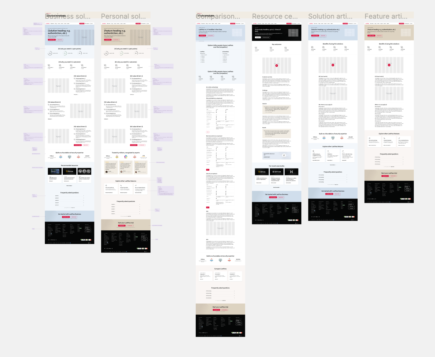
With a brand refresh launching in mid-2024, I wanted to simplify the LastPass website and get ahead of the curve. Cohesion was my priority. By streamlining via templatization, I was able to simplify many aspects of our website, such as:
▸Make the site easier to navigate.
▸Differentiate subpages more clearly.
▸Create intuitive visual and narrative structures.
▸Ease workload when creating new pages.
▸Decommission outdated pages.
▸Make the site easier to navigate.
▸Differentiate subpages more clearly.
▸Create intuitive visual and narrative structures.
▸Ease workload when creating new pages.
▸Decommission outdated pages.
After several rounds of research and updating page designs to align with the upcoming brand refresh, templatized pages were published to the site.
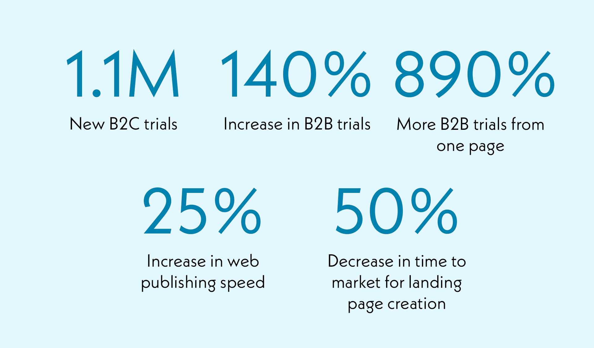
The above work culminated in significant results for the company, web publishing, and others:
Consistency matters
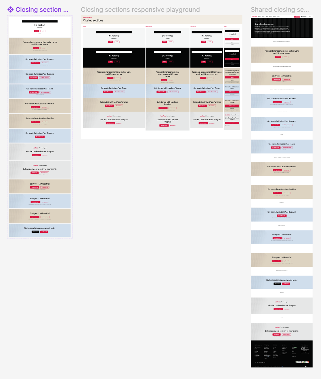
Another significant project I worked on was the consistent maintenance of Web Components and Web Guidelines files stored in Figma and Confluence.
These files serve as the definitive source of truth for our website. Additionally, clear guidelines help my coworkers and me communicate what is and isn't feasible on the website at any given time, making us more dependable.
Components and guidelines include:
Web Components:
▸Article Structure
▸Standardized callout cards (Image on Left)
▸Standardized resource cards
▸Feature stack construction
▸Heroes and Footers
▸Article Structure
▸Standardized callout cards (Image on Left)
▸Standardized resource cards
▸Feature stack construction
▸Heroes and Footers
Web Guidelines (for all components listed above and more):
▸Usage
▸Color and theme
▸Placement
▸Maximum character length
▸Usage
▸Color and theme
▸Placement
▸Maximum character length
Best Practices for Use (Dos and Don'ts):
As a cybersecurity company, consistency matters because inconsistency causes a lack of confidence.
As a cybersecurity company, consistency matters because inconsistency causes a lack of confidence.
Intuitive navigation = a streamlined experience
In accordance with a brand refresh, the above work – site templatization and standardized components – were implemented across the site to give LastPass.com a more cohesive, natural feel.
The site will continue to change, such as for SEO optimizations in response to UserTesting results and updated customer profiles. Regardless of content adjustments, the new site structure will make it easier for users to engage with LastPass.
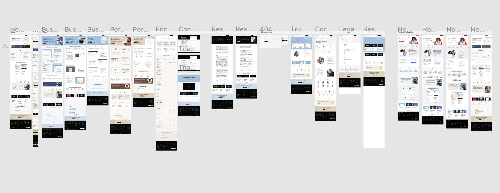
Below are some examples of the site's facelifts I implemented, from the homepage to the Families product page, and the new All Solutions page to the Save & Autofill feature page.

Best practices and standardized writing
Due to being the sole web writer for LastPass, I collaborated with various cross-functional teams: SEO, product marketing, brand and creative, demand generation, legal, sales.
With any given project, there's always some give-and-take, as every team has its own goals and specific KPIs. For this reason, there are always different opinions about what the writing should look like.
To simplify the back-and-forth process of working with other teams, I created internal documents explaining how to write for LastPass.com.
These guidelines explain the reasoning behind certain decisions made when writing for the web, especially when a decision clashes with another team's needs. They provide a means of coming to a resolution by showing how content should be written to meet their goals while still maintaining best practices for site UX.
I developed a series of handoff documents that a copywriter could use to deliver content to other stakeholders. They clearly laid out content structure, component choices, and more.
Similarly, I also provided stakeholders with documents they could fill out when requesting content to make collaboration more efficient, so a copywriter could have all relevant information from the start when developing content.
Creating a story in reverse
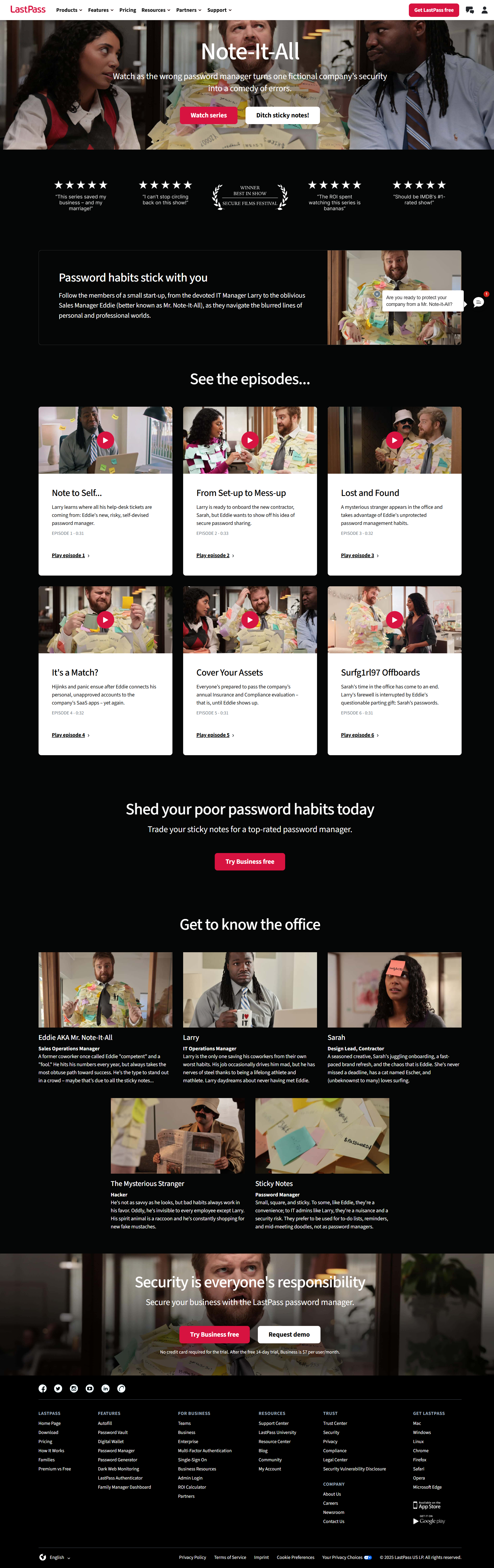
At the end of 2024, LastPass launched a brand campaign featuring Mr. Note-It-All, a character known for his inability to remember passwords. The campaign consisted of six 30-second videos showing office-based comedic mishaps resulting from poor password management.
For the campaign, I developed a standalone brand hub on the LastPass website to feature all the videos. I also had to design an office space. While filming the videos, we knew nothing about the characters, where they worked, or their dynamics.
The timeline was short, so I had to work quickly.
Due to my experience with web UX, I first created a wireframe for the standalone page. I drafted the wireframe in Figma from design and web component best practices (mentioned above). I wanted to ensure that this project could be completed and published on time, so I used pre-built components to guarantee its feasibility.
Next, I began the speculative writing process, developing an idea of what the company was, who the characters were, and how they interacted with one another. This work would bring the campaign to life, making it feel more personable and like a sitcom. Additionally, it could help the brand team draft future advertisements.
By creating a realistic workspace, the six isolated campaign videos were transformed into a larger story where each character feeds into a narrative of relatable workplace habits, personalities, and mishaps.